Intro
You're managing a few properties — maybe more. Rent is coming in, expenses are going out, occupancy fluctuates. You've got spreadsheets, maybe a property management tool, maybe both. And when it's time to make a decision — raise rents, refinance, renovate, sell — you piece things together manually. It works… until it doesn't. Most people think dashboards are just "nice visuals" on top of data, but that's not the real value. The real value is clarity: knowing what's happening across your portfolio at a glance, and making faster, better decisions because of it. This article will show you how to build dashboards that actually drive decisions — not just report numbers.
What are dashboards (really)?
A dashboard is not a chart. It's a system that turns raw real estate data into decisions. Most people think of it as a visual tool with graphs showing rent, occupancy and a few trends. In reality, it's a structured way to collect the right data, organize it clearly, highlight what matters, and trigger action. In a real estate context, a decision-driven dashboard connects the portfolio to its properties and units, links revenue to expenses and profitability, and ties occupancy to turnover and risk.
Why it matters (in real estate terms)
Real estate is slow-moving — until it's not. A small delay in decisions can cost thousands. A good dashboard directly impacts your ROI by helping you spot underperforming properties faster, identify rent gaps, and optimize expenses. It improves decision speed: no more digging through files, no more guessing — just clear signals leading to faster action. It strengthens risk management by surfacing vacancy trends, late payments and expense spikes early. And it lifts operational efficiency through less manual work, fewer back-and-forth exchanges with teams, and better alignment across stakeholders. Without it, you make decisions based on incomplete data, miss pricing and acquisition opportunities, and accumulate inefficiencies that compound as you scale.
The practical framework
Here's how to actually build a dashboard that drives decisions.
Step 1 — Understand your data
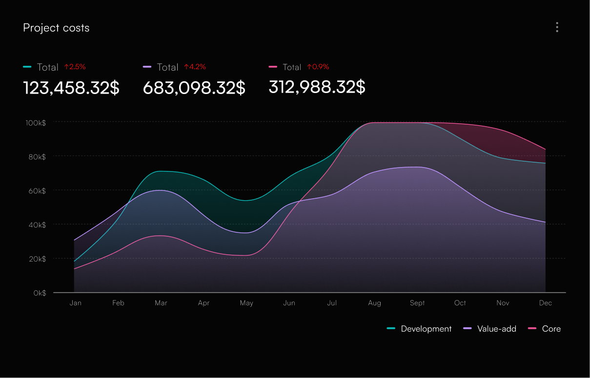
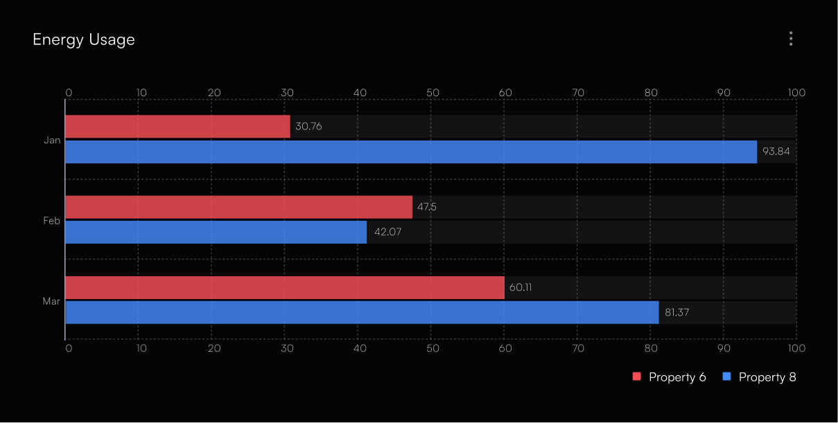
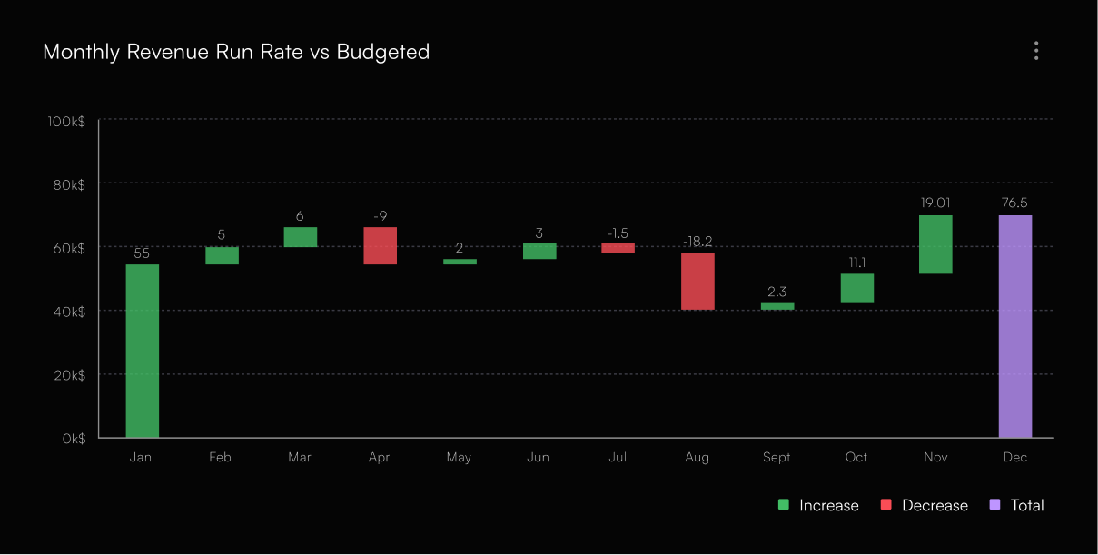
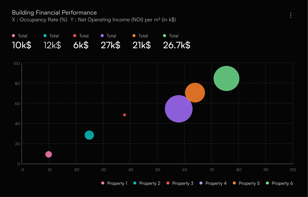
Start simple. You don't need everything — just what impacts performance. The core real estate data points are rent (actual vs potential), occupancy rate, operating expenses, net operating income (NOI), turnover and vacancy duration, and maintenance costs. They typically come from your property management software, accounting tools, spreadsheets and bank statements. The goal here is not perfection — it's consistency.
Step 2 — Structure the information
Most people fail here. The data exists — but it's not organized. Use a simple structure: Portfolio → Property → Unit. For example, Portfolio A contains Property 1 with Units 101 and 102, and Property 2 with its own units. Then layer your metrics on top: revenue per property, occupancy per property, costs per property. This makes comparisons easy — and comparisons are where decisions come from.
Step 3 — Prioritize what matters
Not all metrics are equal. Focus on what actually drives decisions — a simple way to prioritize is high impact plus high risk first. Low occupancy needs immediate attention; expenses growing faster than revenue is a red flag; units rented below market are a clear opportunity. Your dashboard should highlight what's broken, what's underperforming, and what needs action now.
“If everything looks important, nothing is.”
Step 4 — Turn insights into decisions
This is where most dashboards fail: they show data but don't drive action. Every key metric should connect to a decision. When occupancy drops, adjust pricing or marketing. When rent sits below market, increase rent at renewal. When maintenance costs spike, investigate or renovate. When performance is strong, consider refinancing or acquiring similar assets. Your dashboard should answer one question above all: "What should I do next?" If it doesn't, it's just reporting.
Step 5 — Iterate and improve
Your first dashboard won't be perfect — that's fine. Use it, then adjust it. Remove metrics you don't actually use, add ones that influence decisions, and refine how data is presented. Over time, it becomes a decision system, not just a tool.
How to apply this
If you're solo
Keep it simple. Use a spreadsheet, track 5–8 key metrics, and update weekly or monthly. A good setup is one sheet per property and one summary dashboard for the portfolio view. Focus on clarity, not design.
If you're managing a portfolio or team
You need structure and visibility: centralized data instead of scattered spreadsheets, standardized metrics across properties, and shared dashboard access. What matters is that everyone sees the same numbers, everyone understands what they mean, and decisions stay aligned. You can use any tools you like — but the system matters more than the tool.
Common mistakes
A few traps come up over and over. Tracking too many metrics — more data doesn't mean better decisions. Overcomplicating the dashboard — if it takes effort to understand, it won't be used. Failing to link data to decisions — without action, there's no value. Relying only on historical data — you also need forward-looking signals like trends and risks. And updating inconsistently — outdated data quickly destroys trust in the system.
Conclusion
Dashboards are not about visuals — they're about clarity. In real estate, the people who win are not the ones with the most data, but the ones who can see clearly and act fast. Start small: pick a few key metrics, structure your data, and connect it to decisions. That's it. Do that well, and your dashboard becomes one of the highest ROI tools in your business.